Here is a selection of graphic works such as Branding, Editorial, Illustration and more.
Queima das Fitas Porto – Branding
Branding produced for the annual university student’s festival that celebrates the end of their studies: Queima das Fitas in Porto, Portugal.
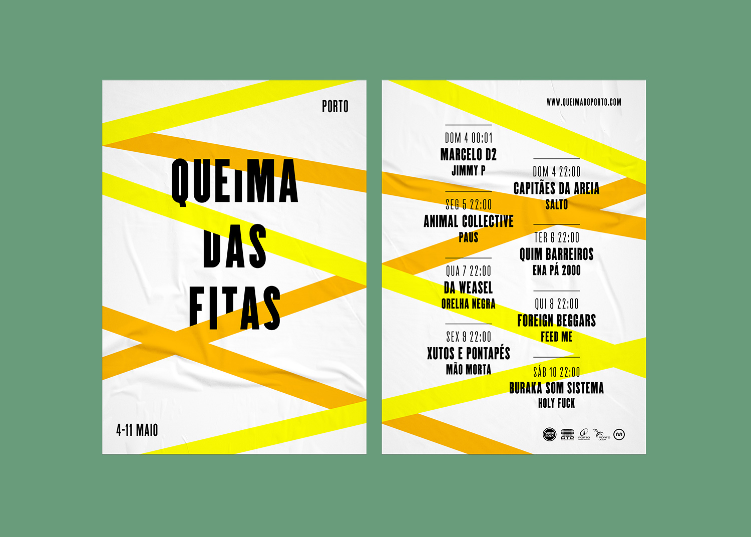
Queima das Fitas translates to “Burning of the Ribbons”, as the ribbons symbolise each field of studies in Portuguese universities. With that information I started this project, using the ribbons as a graphic option to explore.
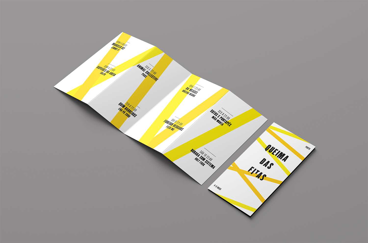
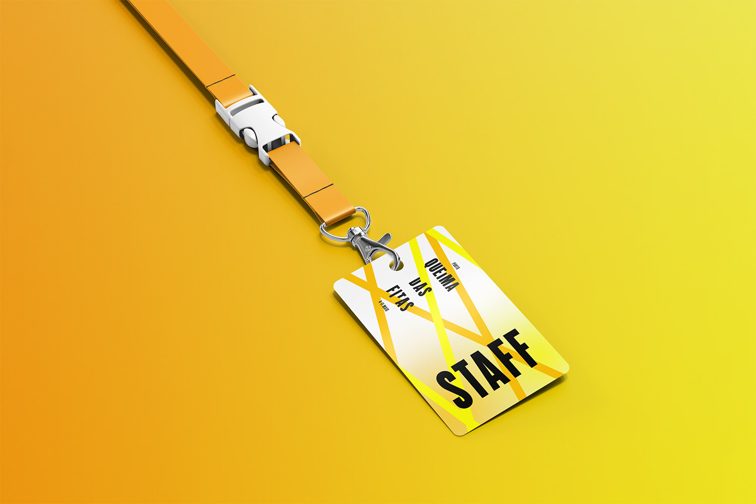
The ribbons make the whole branding more dynamic visually. They are balanced by a bulky and condensed typeface that communicates the information more boldly, making it an eye-catching and efficient design for a student festival.
Tools
Adobe Photoshop / Adobe Illustrator / Adobe InDesign / Screen printing
CPS – Logotype & Branding
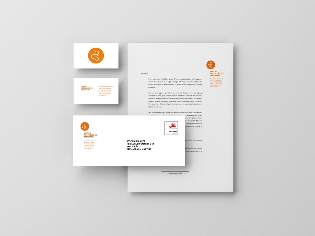
Logo and branding for the Portuguese screen-printing organisation: CPS – Centro Português de Serigrafia.

I started by messing around with the initials “CPS” until I joined them together in a round and smooth way that resembles the processes of printing. For the colours, I decided to use orange because of its warm but not invasive properties, adding a bit more presence and contrast to the logo.
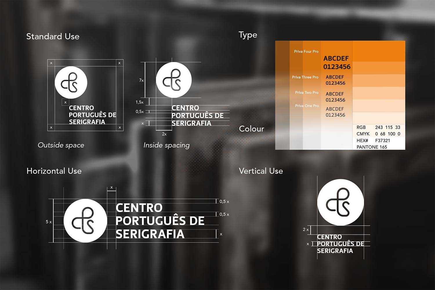
Much like the logo, I took the branding towards a clean, straight-to-the-point direction.
Tools
Adobe Photoshop / Adobe Illustrator / Adobe InDesign
Kate Skateshop 10 years – Illustration
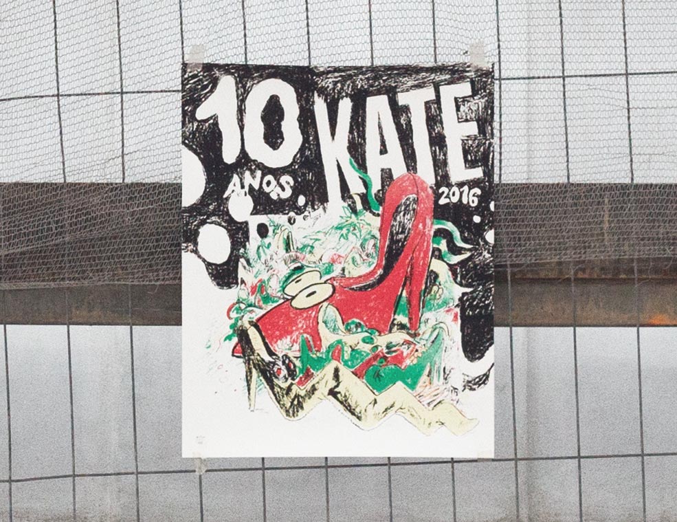
Illustration and screen prints made to celebrate Kate Skateshop’s 10 years anniversary.
Tools
Hand drawing / Screen Printing
Grupo Lobo – Illustration & Merchandising
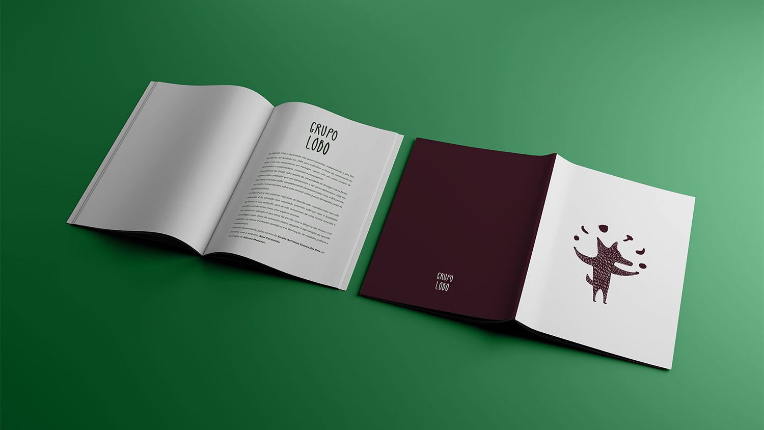
Illustration and merchandise created for Grupo Lobo – an organisation dedicated to the preservation of the iberic wolf.
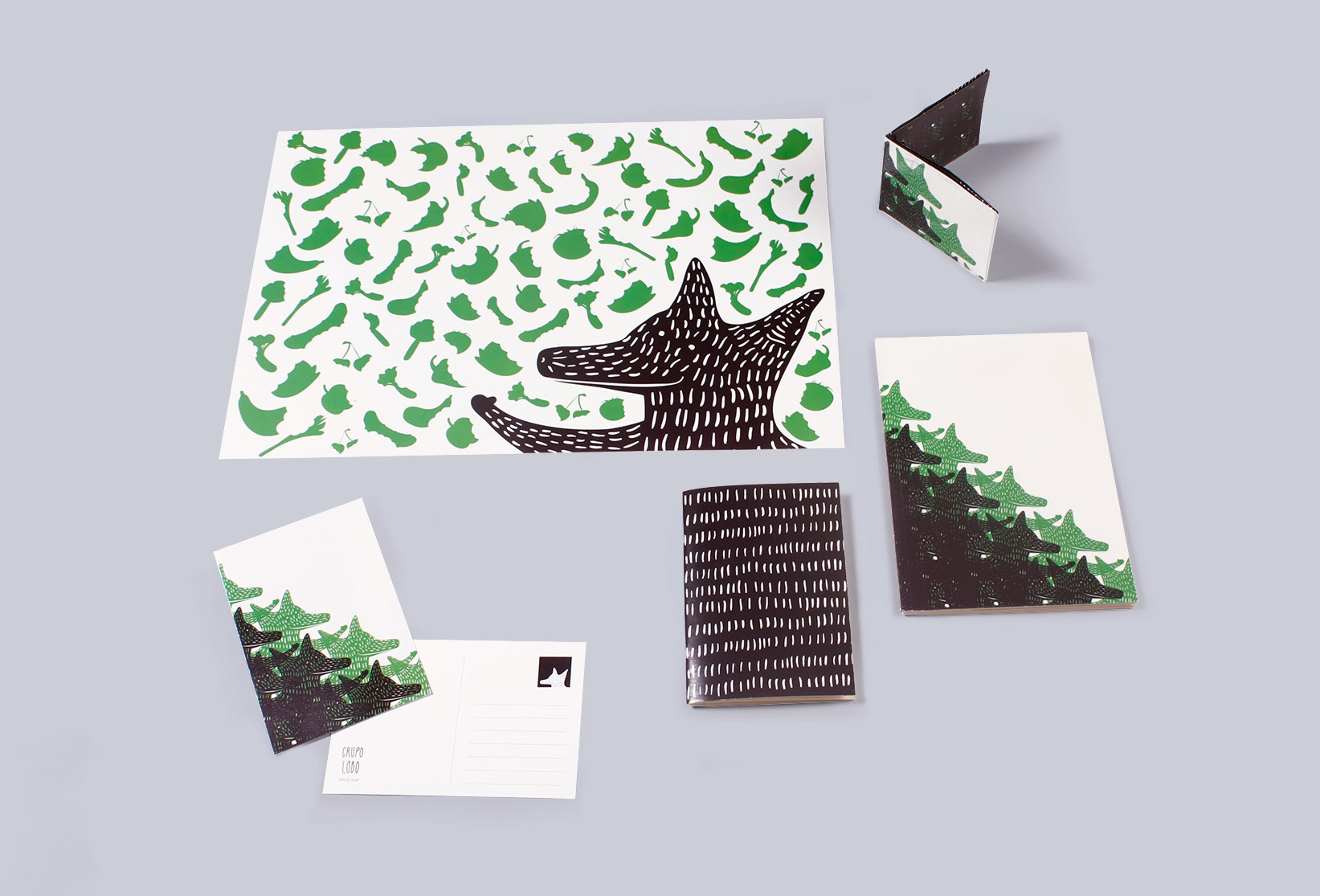
Wolves don’t have a good reputation in many mainstream stories like little red riding hood, when in reality they actually don’t mind much about people and they might be more friendly as pictured.
To help make them more friendly the idea was to create a smiling and friendly wolf that lives happily surrounded by vegetables because he actually is vegan.
Tools
Adobe Photoshop / Adobe Illustrator
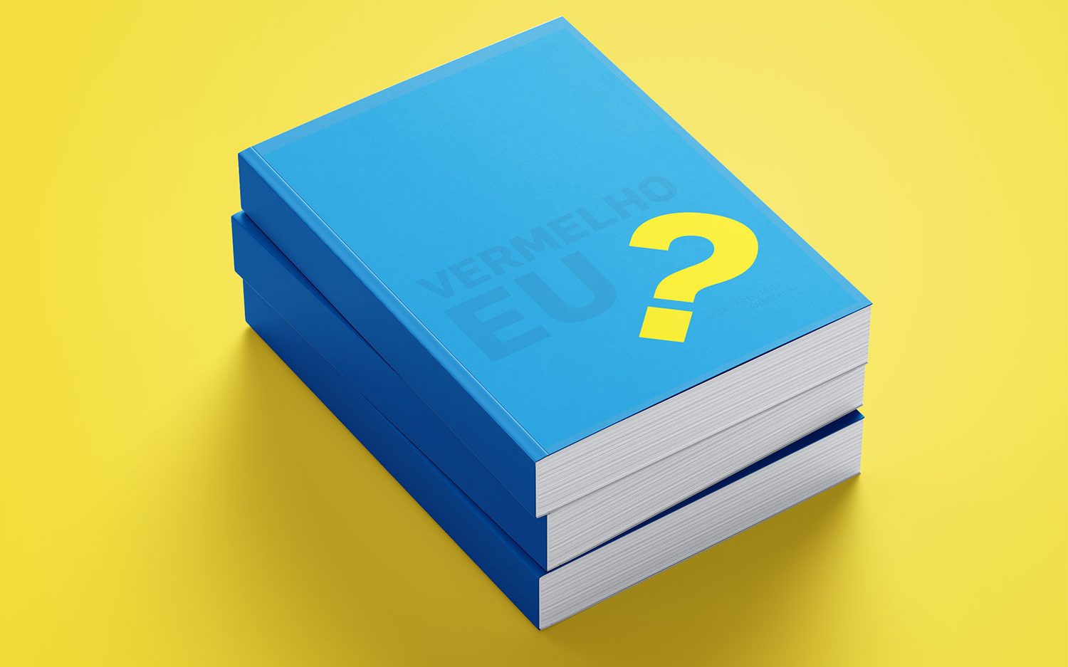
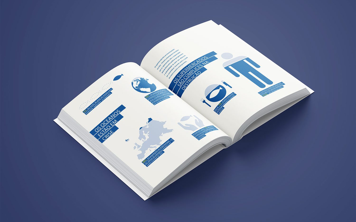
Vermelho eu? – Editorial
“Vermelho eu?”, which translates to “Red, Me?”, is an editorial to make people aware of problems caused by excessive fishing activities. The title that contradicts the colours used (blue and yellow) to make the reader think how these social-environmental issues should be seen as red-flags.
Tools
Adobe Photoshop / Adobe Illustrator / Adobe InDesign
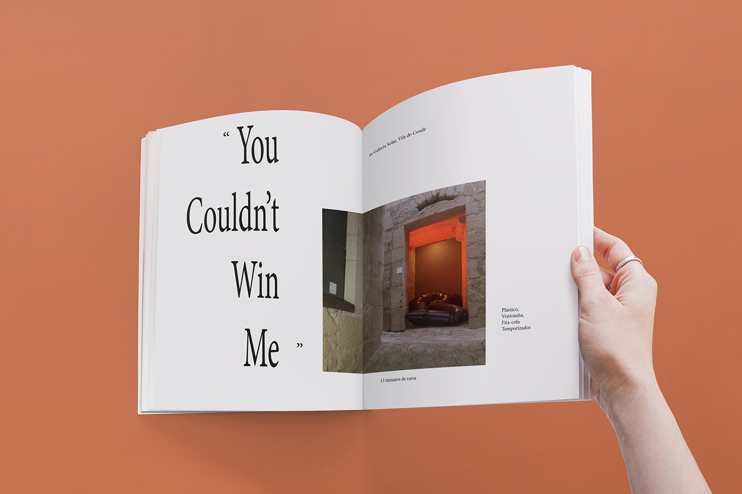
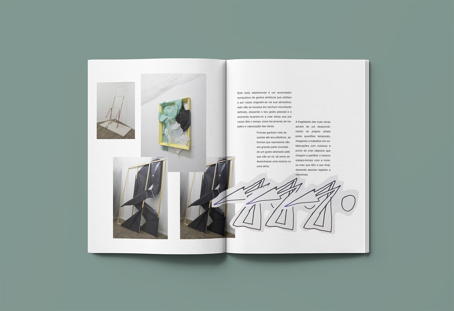
Editorial for Arts – Editorial
Editorial made to showcase artistic pieces. A little bit messy, clumsy, but bold design that resembles the process of art-making.
Tools
Adobe Photoshop / Adobe Illustrator / Adobe InDesign