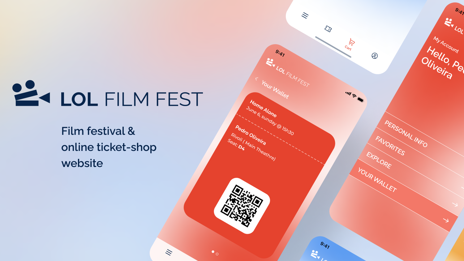
UX & UI Design for a film festival website with ticket-shop and wallet all in one place, along with all the information about the festival.
User Research
We started by running a comparative assessment as well as heuristic evaluation on similar websites to have an idea of the goods and bads of existing ticket-shops and film festival websites.
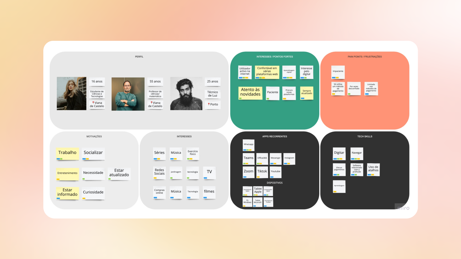
We rounded up interviews with different people in order to better understand the way this type of site is used, what they need and they don’t want.
Persona
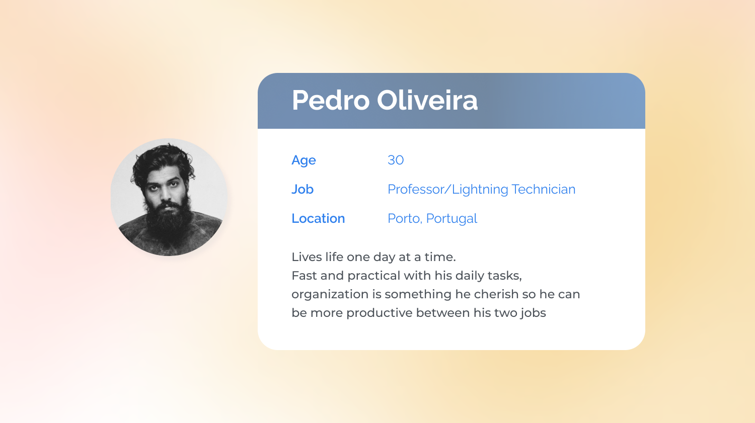
While some answers diverged others converged. With the identical answers we created a persona: Pedro Oliveira, 30 years old, works two jobs, fast-pace living and of course has his needs and pain-points while using digital products.
This persona is a fictitious yet pragmatic character and will be a key figure during the design process, helping us to design this project based on his point-of-view, needs and pain-points.
Information Architecture
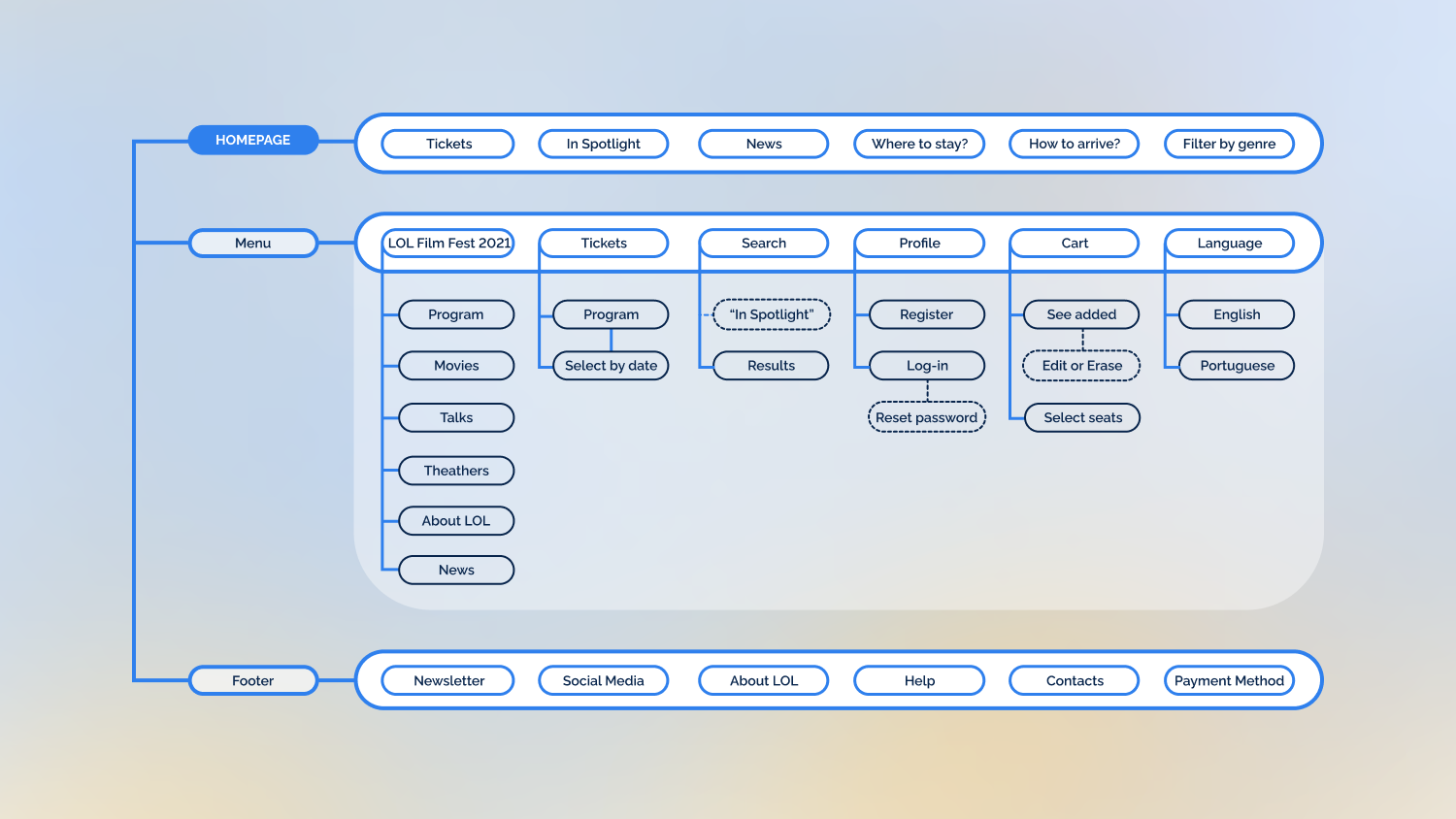
Having the research and persona we idealised, categorised and organised all the content needed for the website, ending up with an Information Architecture map. Always paying attention to the persona, ensuring the essential content and possibilities to his use.
Wireframe
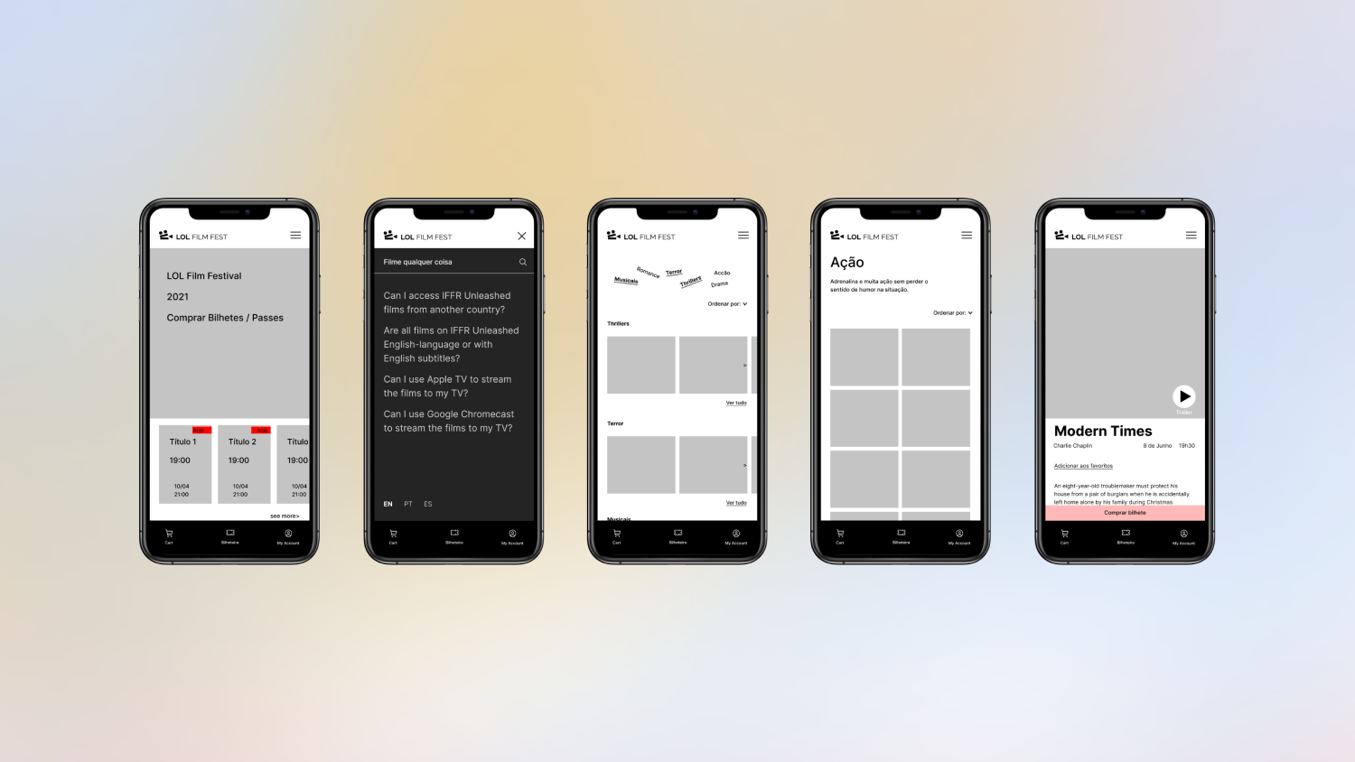
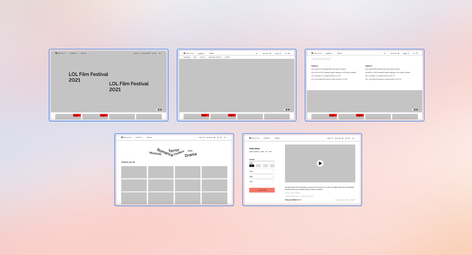
From 8 paper sketches of interfaces we turn them into digital wireframes. This is the first step into the User Interface design stage; here we visually organize the pages content in a grey-scaled low-fidelity prototype of the site interface.
A bottom bar navigation was ideal for the mobile version, to help our persona have a one-click way to the ticket-shop and his ticket’s wallet, so he can buy tickets and show them at the entrance, fast and easy.
User testing
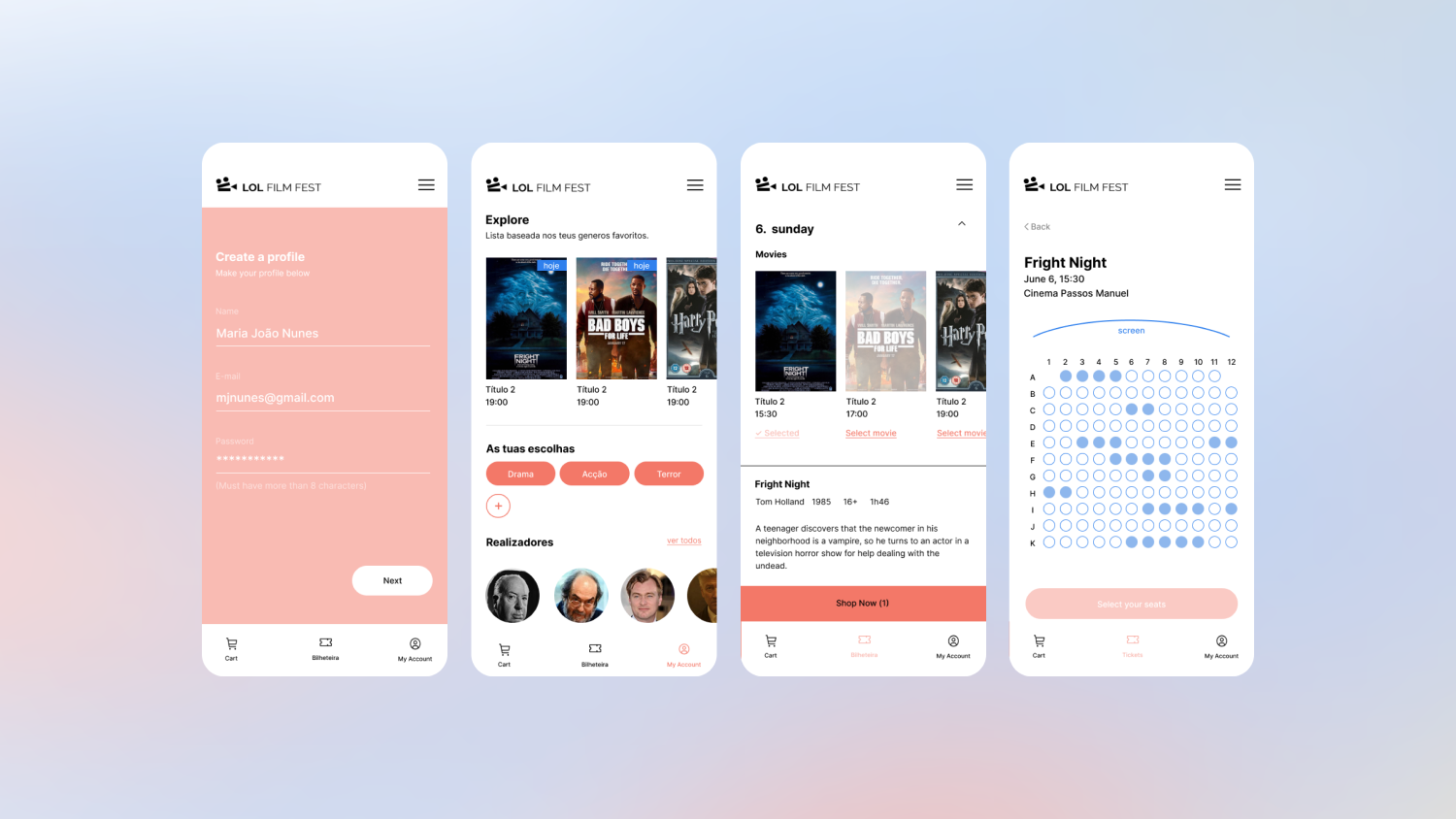
The tickets are only sold online, so the main focus at this stage was to think of a user journey where the user starts by buying multiple tickets to specific movies and at the end have to show them in the wallet in order to enter the movie. Since people would mainly use their phones to show tickets on the entrance we ran the test using the mobile prototype (after upgrading it into a mid-fidelity prototype and adding all necessary pages and interactions to do it.
The tester is free to find its way to complete the tasks and to speak out loud what feels/thinks while doing it. This gave us enough to analyze their behaviour and mistakes, as it is an excellent way to figure out what worked and what it’s missing in our design to do continuous improvement.
UI Kit
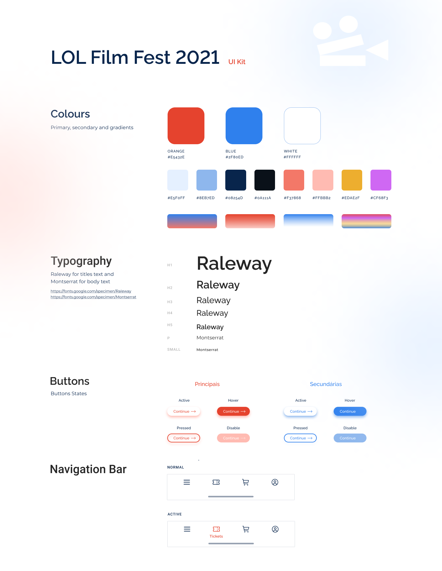
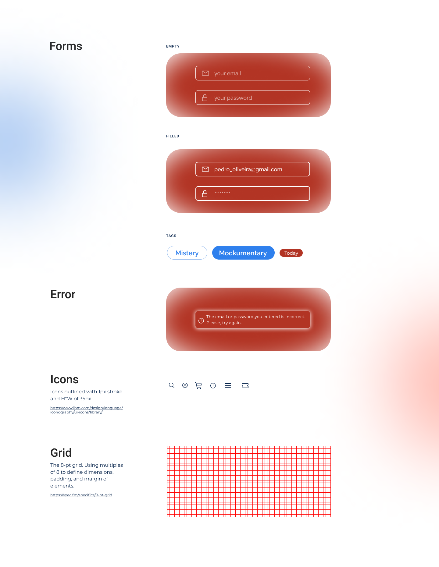
With the client’s briefing and a moodboard we designed a style guide & UI Kit where we determine the colors, typography, icons and much more design elements and hierarchies.
All this steps were essential to make a really user-friendly and user-centered design that provides the right product to fulfill the user’s needs and pain-points.
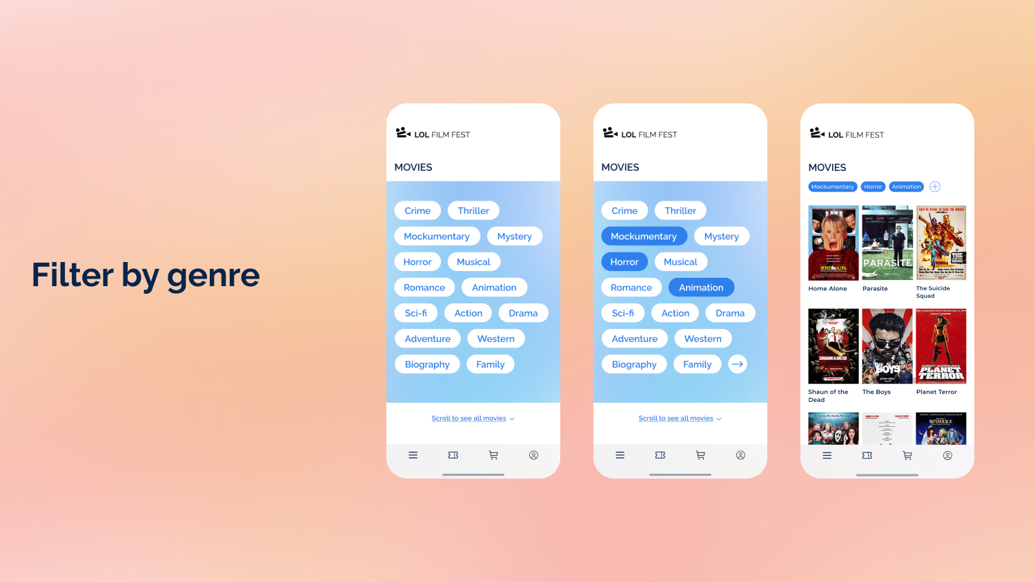
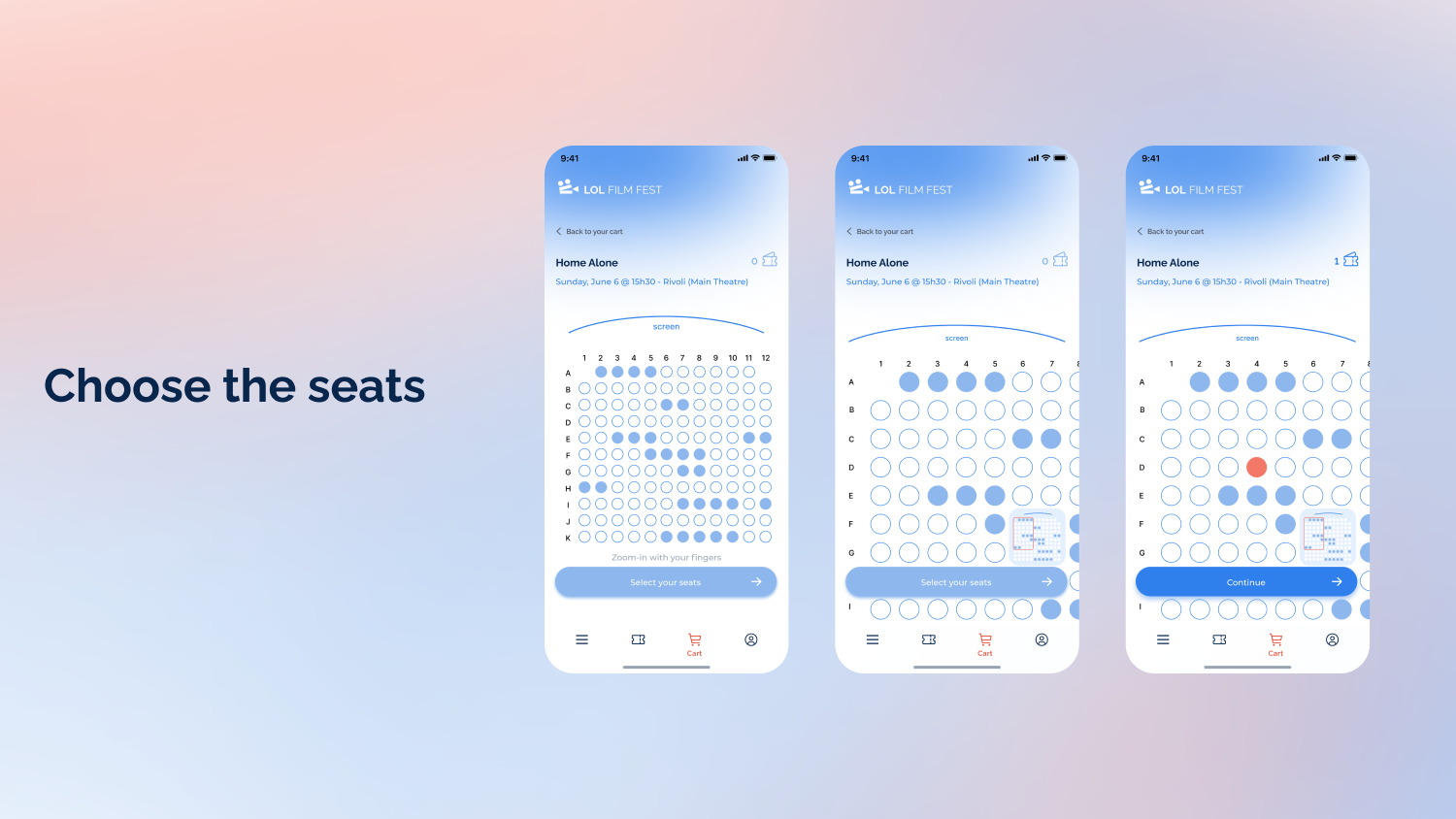
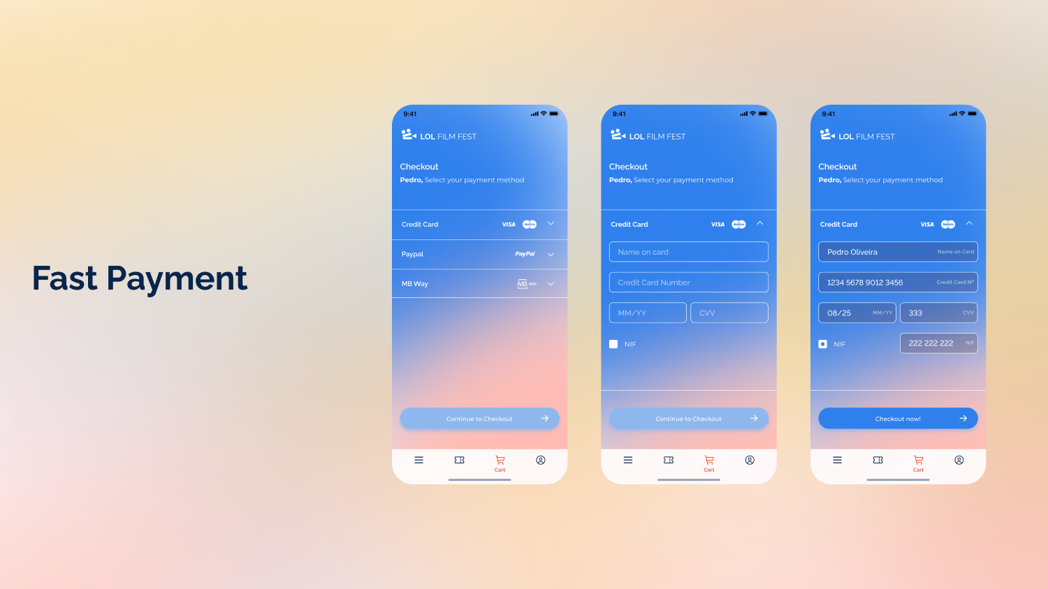
Let’s also remember our persona, Pedro, and meet the three aspects he most looked forward in this site:
Design team
Afonso Menezes & Bárbara Alpuim
Areas
UX Design / UI Design / Visual Design
Tools
Figma – Design and Prototyping
Miro – Research and Brainstorming
2021